The OXD rebrand
Client
OXD (formerly OpenRoad Communications)
Year
2019
My role
Creative director leading the strategy, the methodology, and a core team of thirteen — with extended contributions from across the company — through naming, identity, messaging, and launch
Sector
Professional Services
In one line
Renaming and rebranding a 23-year-old digital consultancy by running the project the way we'd run a UX engagement.
The big idea
Branding = User Experience
Project team
Creative & design: Wil Arndt (CD, copy, brand strategy), Kallie Ashenden (design director), Anne Buchan, James Byun, Josh Herlihey, Kaitie McGowan Marketing & additional copy: Sagal Kahin Web: Foley Lynn, Steve Ly, Sophie Repoussard PM: Joey Bevacqua Leadership: Darren Gibbons (president), Gordon Ross (VP, copy)
With contributions from Jacqueline Antalik, Deborah MacKenzie, Charles Shin, Justin Johnson, Lawrence Chan, Julie Robinson Jones, Chanel Lethbridge, and others across phases.
The challenge
OpenRoad Communications was an analytical, consensus-driven company of 70 people who could turn a single decision into gridlock. In 2018 I advocated a rebrand—and to run the project myself.
The name OpenRoad came from 1995, when the company was a web applications developer riding the optimism of a fledgling internet industry. Two decades later, with new capabilities, services, and my own agency Mod7 folded in, that name no longer described what the company had become.
Rebranding an established company is hard.
Rebranding yourself is harder.
The approach
Like many creative projects I've run, I approached this one with rational methods—research, frameworks, structured evaluation—so the decisions wouldn't come down to taste alone. The difference this time was scale: I was using those methods on the company that employed me, with 70 colleagues as the audience.
Working with our decision-makers
Anyone who's worked in creative knows the dreaded words: "It just doesn't feel right," or "I'll know it when I see it." Decision-makers lack the visual vocabulary and the rational tools to evaluate whether a design meets the criteria for success—especially with naming and branding, where their careers and businesses are on the line. No wonder they react with vague, emotional statements.
The logic and rational frameworks of UX combat that. They help everyone agree on what matters, reduce bias, and take the risk out of the decision.
Generative methods
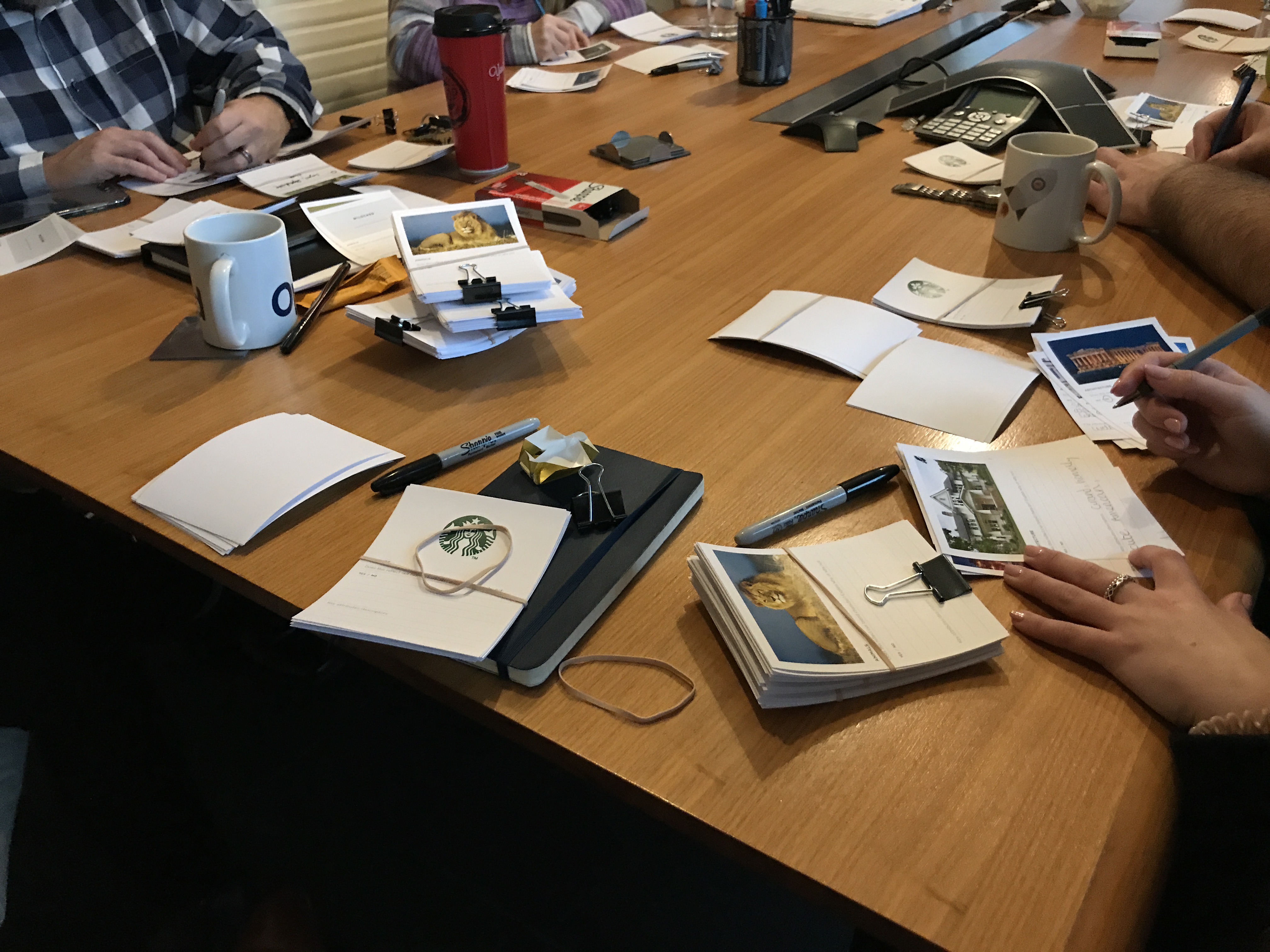
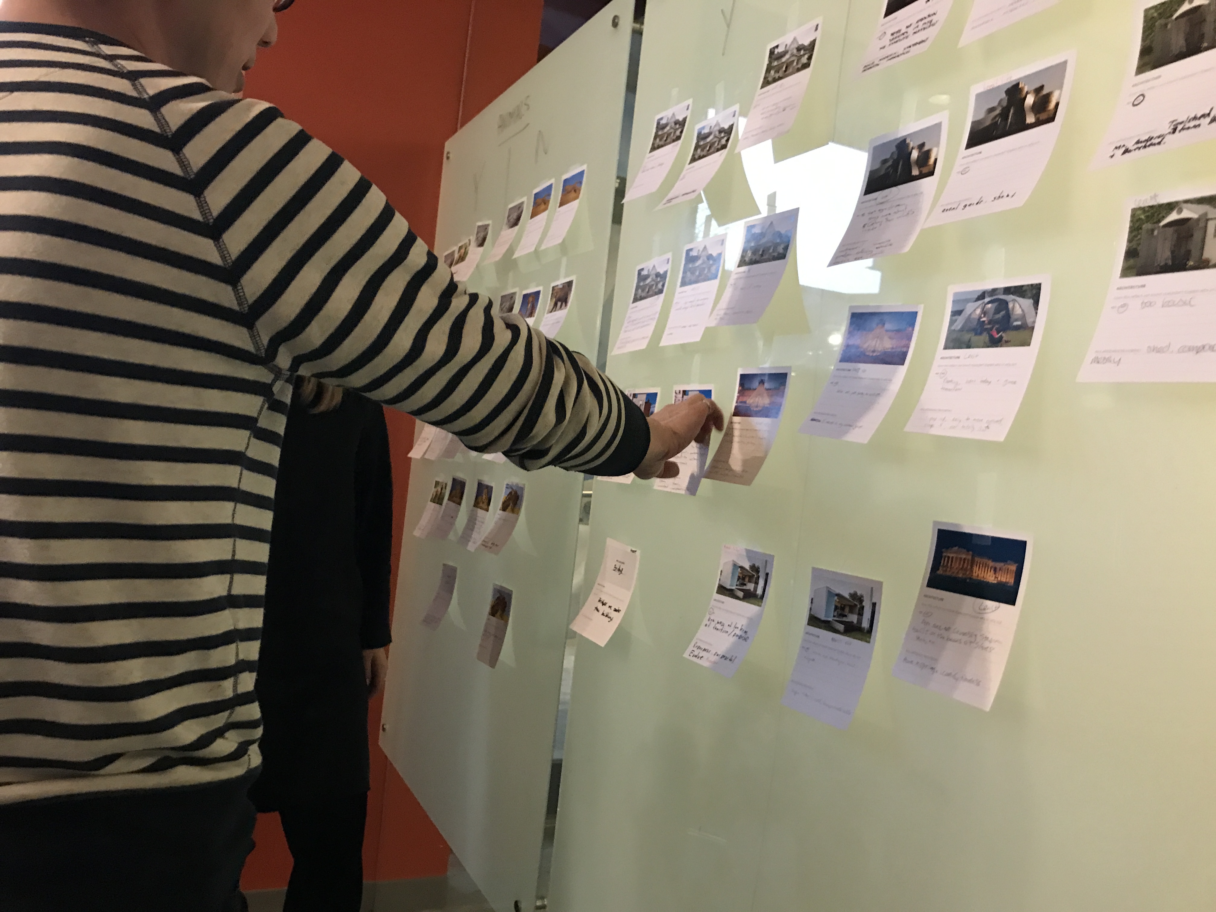
We ran two staff-facing methods to generate ideas. A brand personality workshop was a one-hour exercise that helped staff articulate their feelings about the character of the company, yielding hundreds of useful descriptors. "OpenRoad is a golden retriever because we're friendly, approachable, trustworthy." "OpenRoad isn't ego-driven like Bilbao." A naming jam: a two-hour workshop with over a dozen staff, structured as several cycles of diverge/converge to generate fresh name ideas. Tightly planned, but designed to help people free-associate into unexpected directions. Alongside these, brand interviews with new clients, past clients, potential clients, new employees, and people who'd turned down job offers gave us a balanced view of perception, and domain mining surfaced novel .com options. By the end, my team had generated 3,839 name ideas.
Evaluation methods
Four frameworks let us evaluate at scale:
- Name evaluation criteria — agreed in advance (.com availability, easy to remember, sounds good spoken, not tech-or-service-based, has a story, simple and direct), so decision-makers had a ruler regardless of whether they subjectively liked a name.
- Word and theme analysis in Airtable revealed the overlap of competitor language, market perception, and authentic personality.
- Descriptive facet analysis classified competitor names by type, exposing gaps in the namespace.
- Igor Naming Evaluation scored names quantitatively against criteria the framework provided.
Layered as a heatmap, these made evaluations simpler and defensible. The candidate list dropped from 3,839 to 2,800 to 1,600 to 33 to 3 to one.
Prototyping the brand
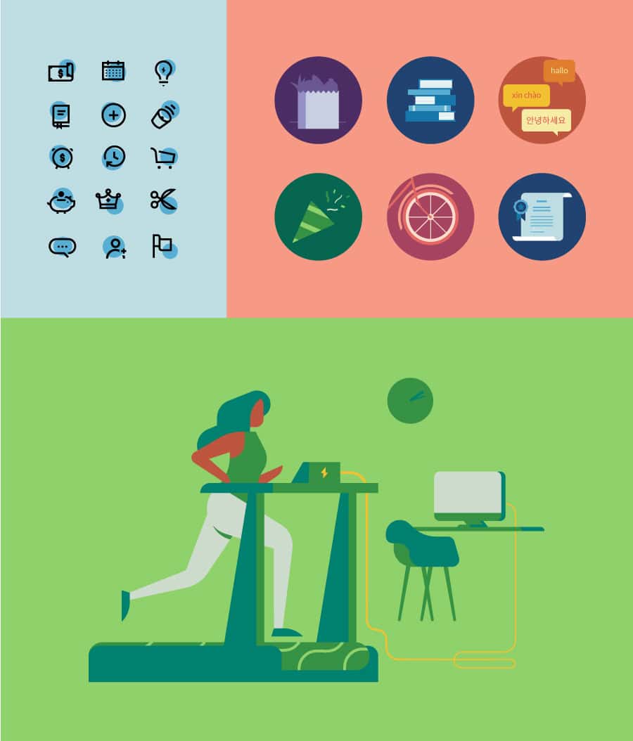
By the time leadership picked OXD, staff hadn't seen it yet. A three-letter name doesn't sell itself, and we knew there would be a lot of emotion connected with the old name. So just revealing the process and the name wasn't enough—we had to inspire people, share a vision for what OXD could be. We had to prototype the brand. My design director developed a beautiful 76-page presentation showing how OXD could live: photography direction, infographics, business cards, a fictitious website, document templates. None of it was final identity work; it was a prototype to make the name feel inhabitable. Where most prototyping persuades a client, ours was built to make decision-makers confident in their own choice.
The work
The double-diamond process applied to naming, brand, and identity.

Two diamonds: Renaming/Strategy and Identity/Execution, each running Searching → Evaluating → Prototyping → Delivering. The company already used this model on client work, so the structure itself lowered the temperature on every decision downstream.
Brand personality workshop.
Where authentic differentiation lives.

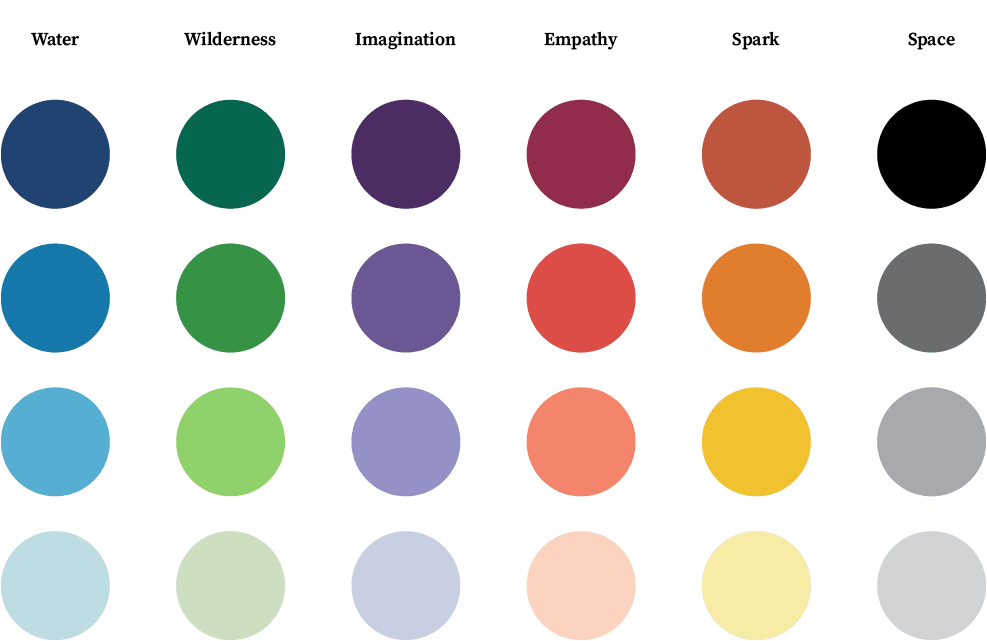
Word and theme analysis in Airtable, mapped against a three-circle Venn: what the competition says, how people see us, our authentic personality. The diagram articulated the overlap to avoid (where we'd sound like everyone else) and the overlap to lean into (true, believed, unclaimed).
Two scoring frameworks layered into a heatmap.
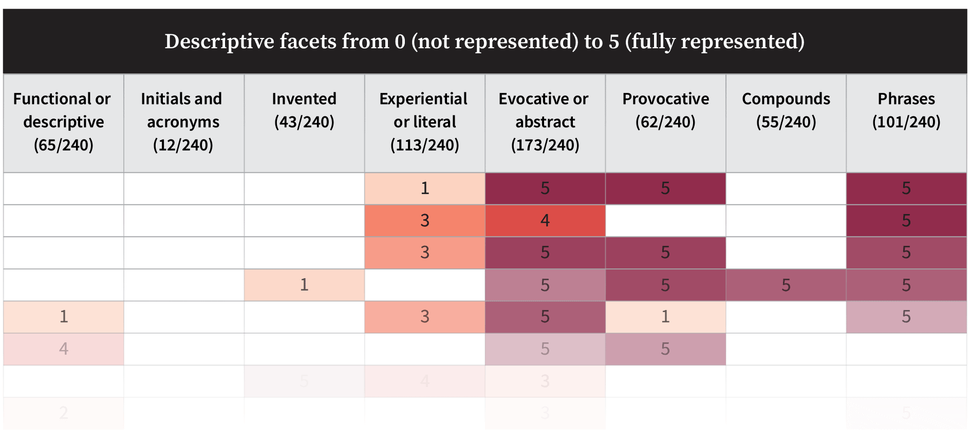
Descriptive facet analysis classified competitor names by type. Igor scored them on quantitative attributes. Layered, they read as a heatmap of the namespace: crowded zones to avoid, gaps where a new name could differentiate.
733 → 1,998 → 2,478 → 3,839 → 2,800 → 1,600 → 33 → 3 → 1.

Each number is a phase: naming jam, staff expansion, brainstorm, domain mining, then convergence under the evaluation criteria. Every drop happened against a criterion we'd agreed on in advance, so no cut needed defending on taste.
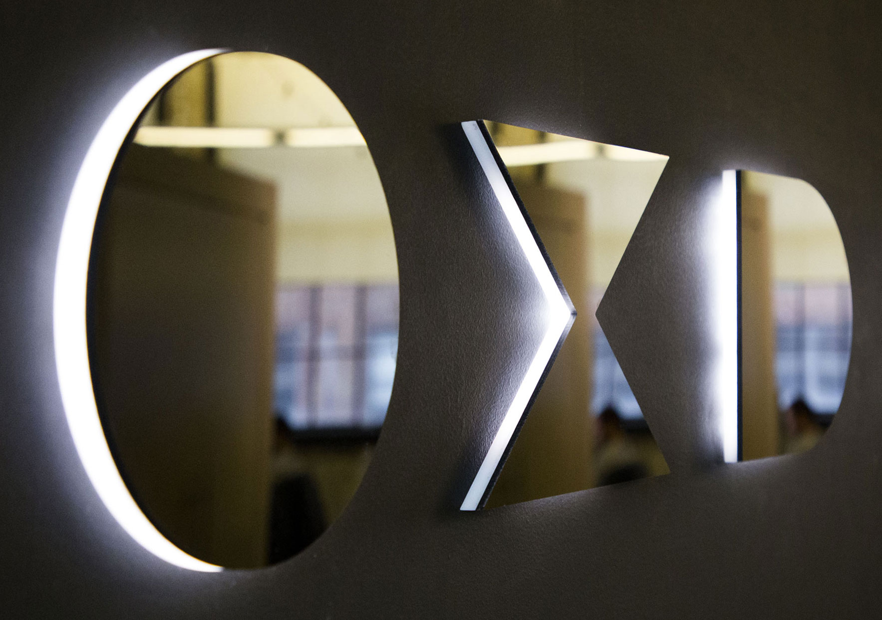
Logo as compressed concept.
O and D as bookend letters from OpenRoad. X as two arrows converging vertically and two converging horizontally. The strategic idea—convergence of people, approaches, technologies—made into a mark.
Kit of parts.
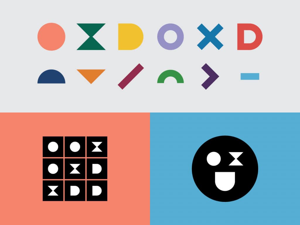
My talented design team developed a modular identity system that could be applied by non-designers across a 70-person company in G-Suite, in client decks, in signage. This kit was built as replaceable elements rather than only fixed templates. Seven years on, the same kit is still in active use without drift.
Voice as part of the system.
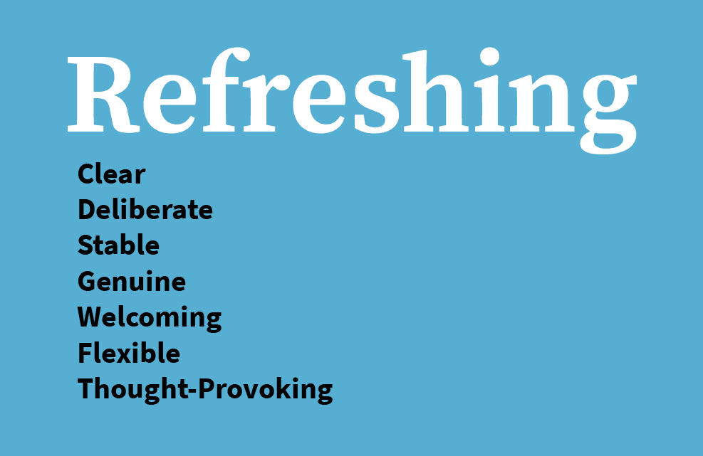
I developed editorial guidelines by auditing existing communications to extract what already sounded like the company at its best, rather than inventing a voice from scratch. The guidelines codified word-level rules, sentence-level conventions, and "say this, not that" examples so non-designers could apply the voice without interpretation.
This same logic was applied to the kit of parts my team created: replaceable, applied at scale, low drift. The seven characteristics are what the guidelines aim for: Clear, deliberate, stable, genuine, welcoming, flexible, thought-provoking.
The outcome
| Before | After |
|---|---|
| Analytical, consensus-driven company afraid that a rebrand would tear itself apart | Brand the same staff still champions seven years later |
| Two-letter, descriptive name from 1996 that no longer matched what the company did | Three-letter brand built on a strategic idea—*convergence*—the company still uses to describe itself |
| Visual identity sprawl: client decks, signage, social, templates drifting in different directions | A modular kit-of-parts system non-designers can apply consistently, still in active use without drift |
| Brand and UX practiced as adjacent disciplines | A working argument—internally and externally—that they're the same discipline |
Staff response
"One year later, and I love the brand even more. I truly believe it positions us as the world-class consultancy we are."
Reflection
Late in the identity phase, the owners had a defensible shortlist of logo directions and a timeline barrelling toward launch. They made the call any reasonable leadership team would make under those conditions: picked one and kept things moving.
The one they picked was fine. But something gnawed at me. My twenty-plus years of creative direction told me we could do better. We could aspire towards something more elegant, more durable, more distinctive.
So I pushed back. Not with a framework, but a rational argument for taste and a vision for convergence. The owners agreed. We shipped that logo. It's still in market seven years later.
Frameworks don't always win. But the rigour underneath shifted my objection from "I'll know it when I see it" to trust. The owners trusted that I was using taste in service of an argument we'd already agreed on. Rigour isn't there to replace creative judgment. It builds the shared context for it.